Key Tools and Techniques for Effective BI Reporting

- Use data modeling tools like dbt to streamline data preparation for BI reports.
- Leverage BI platforms such as Tableau and Power BI for interactive reporting.
- Implement automation and integration tools like Airflow for efficient data workflows.
Business reporting is critical to business development, providing valuable insights into a company’s performance and enabling informed decision-making. There are several reasons why reporting is important in business development. To be a Successful Business Intelligence developer, one should know several layers of Data processing, modern Cloud techniques & Platforms, Wireframing, third-party tools, and integrations.
In today’s data-driven business landscape, Analytics and BI have become essential to decision-making processes. With the help of advanced analytics and BI tools, businesses can effectively analyze vast amounts of data and gain insights into various aspects of their operations.
These insights can then be used to make data-driven decisions that optimize business performance and drive growth. Additionally, integrating analytics and BI with other business systems can provide a holistic view of the organization’s performance, enabling businesses to make informed decisions based on real-time data. Therefore, a strong understanding of Analytics and BI is essential for businesses to thrive in today’s competitive marketplace.
As a BI Developer, the major work would be understanding the business and getting the stakeholders’ requirements. Communication plays a key role in this phase of work. After getting the requirement, the steps involved in the development are,
- Wireframes
- Data Modelling
- Report Development
- Performance Tuning
- Publishing and sharing
1. Wireframes
Wireframes help define a report’s goals and objectives and visually represent how the design will support these goals. This resource serves as a valuable tool for stakeholders seeking to enhance their understanding of design processes, providing them with concise and informative content to facilitate their familiarity with the subject matter.
Wireframes can be used as a starting point for discussion and collaboration between BI developers and stakeholders. They provide a shared understanding of the report and can help identify improvement areas.
It helps in identifying potential design problems early in the process before the design has been fully developed. This can save time and resources in the long run. One of the tools is Figma. Most developers choose and easy to go with UI/UX tools.
One can collaborate with the team & stakeholders and can parallelly build/edit the wireframes. The cool part is that the feedback can be seen within no time of adding it. One can have plugins and see how the wireframe looks for different platforms like Web, App, Android, IOS, and Desktop, etc. These tools bring the user interface and the user experience with no code.
Overall, wireframes play a crucial role in the reporting process by providing a clear and concise visual representation of the design and helping to facilitate collaboration and communication between team members and stakeholders.


2. Data Modelling
The initial and pivotal phase of report creation entails testing our proficiency in SQL and understanding of data warehousing principles. It is imperative to possess a solid comprehension of SQL fundamentals, such as Relationships, various join types, Key types, Indexes, stored Procedures, Schema types, and other related concepts.
Any error in the joins or relations will have further repercussions, making the entire Analysis futile. We should decide whether to import the data or connect Live, depending on the data volume – many BI tools like Power BI, Tableau, QlikView, etc.
If we consider PowerBI, we have DirectQuery, Import, and Live. With the latest enhancements, composite models are widely used in industry, which is apt if we have a large volume of data from the fact table. It’s up to a BI developer to contemplate which mode the data model fits.
In most business use cases, we cannot expect cleaner data. Sometimes we may have to make transformations. We have an inbuilt Query Editor (PowerBI) and Tableau prep (Tableau) for this. One should also have some basic understanding of ETL tools like Alteryx, SSIS, Azure Data factory, AWS Glue, etc.,
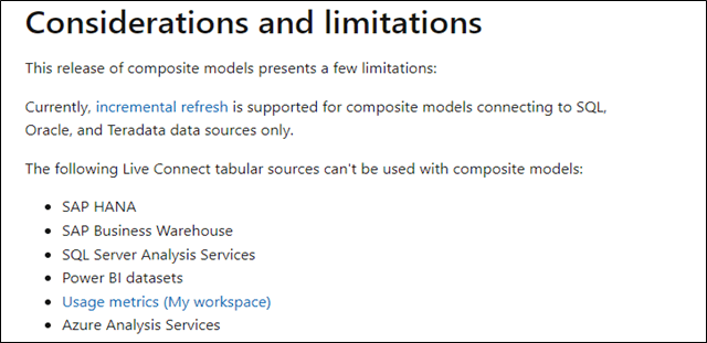
Looking at the limitations will be quite handy. Considering PowerBI, BI Developer should look at the Microsoft documentation for all the limitations during connecting to a DB. If we choose to go with Direct Query mode, we must first look at the limitations: Query limit, Gateway issues, Limited DAX, and Limited transformations.
An effective BI developer prioritizes assessing the limitations before constructing the data model.
Reference: –
So, BI developers should be frequently updated on the latest releases in the respective BI platform websites.
3. Report Development
Once the report wireframe has been finalized, the actual report building starts. Report development in BI is creating interactive and visually appealing reports using BI Tools like Tableau, PowerBI, etc. The selection of charts is an important step in the report development process as it can significantly impact the report’s effectiveness. Here are some factors to consider when selecting charts,
- Data type: The first step in chart selection is to consider the data type we are working with. For example, a bar or pie chart may be appropriate if we have a categorical variable. A line or column chart may be more appropriate if we have numerical data.
- Data pattern: Consider the pattern of the data and select a chart type that best represents that pattern. For example, if we have time series data, a line chart is often a desirable choice as it shows changes in the data over time.
- Purpose of the report: Consider the report’s purpose and select a chart that best supports that purpose. For example, a histogram may be a desirable choice if you are trying to highlight the distribution of values. A stacked bar chart is a better choice when comparing multiple data sets.
- Audience: Consider the audience viewing the report and select a chart they will find easy to understand. For example, if a technical audience views the report, you may use a more advanced chart like a scatter plot. A simple bar chart may be a better choice if a non-technical audience views the report.
- Interactivity: Consider the level of interactivity you want to provide and select a chart supporting that level. For example, choose a chart supporting drill-through actions or tooltips to let users explore the data more thoroughly. Here is the link for the chart selection.
4. Performance Tuning
Performance tuning is an important aspect of reporting, as it helps to ensure that reports are fast and responsive, even when dealing with large amounts of data. Some of the cliche techniques are as below considering PowerBI;
- Writing efficient DAX expressions can improve the performance of reports. For example, using calculated columns instead of calculated measures, and avoiding complex DAX expressions, can help to improve performance.
- Visual Optimization: A report’s type and the number of visuals can significantly impact performance. Consider reducing the number of visuals in a report and selecting visuals that are optimized for performance, such as tables and matrixes.
- Server Configuration: The performance of reports can also be impacted by the configuration of the server where Power BI is running. Consider using a server with high memory and processing power to ensure that reports are fast and responsive.
- Data modeling: Data modeling techniques, such as data aggregation, indexing, and partitioning, can help to optimize the performance of reports by reducing the amount of data that needs to be processed.
And more, we also can make use of open-source, free third-party tools to optimize the report,
Image Source: (Microsoft)
5. Publishing and Sharing
In Big Organization, publishing and sharing reports is quite challenging. One has to be aware of Row-level security, Permissions, Access types, scheduled refreshes, etc. If the data is being fetched from on-premises, the gateways should be enabled in PowerBI / Tableau bridge in Tableau.
In some cases, stakeholders would opt for alerts of the report directly to their mail/teams/slack. BI developers should know how to configure and add the user group, which may be through adding the users or through an active directory group. Besides this, BI developers should also know some of the basic admin tasks.
Conclusion
The role of a Business Intelligence (BI) developer is crucial in turning data into actionable insights for organizations. From designing, developing, and implementing BI solutions to maintaining and updating them, the responsibilities of a BI developer are diverse and constantly evolving.

Momin Ahamed is working as Data Engineer at Anblicks. He Builds reporting solutions to clients and analyzes data to help Businesses act accordingly. Also, he is enthusiastic about building Modern dashboards that look too good using wireframing tools like Figma. He understands data cleansing, preparation, ingestion & transformation well.


